Contents
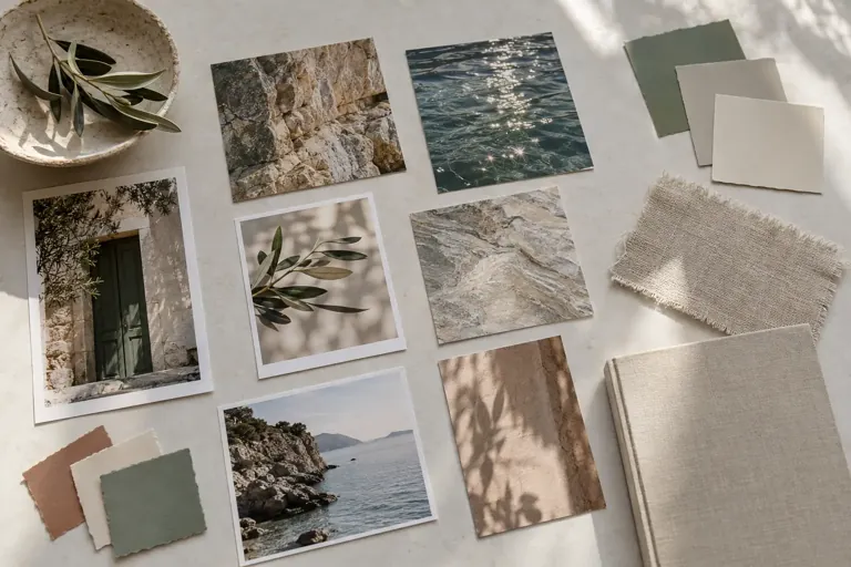
To build a collection of visual references, keep only a few images at a time and note what interests you about each one: composition, color, material, lighting, or use. Add the source and organize them around your project questions. A useful collection isn’t just for accumulating things you find beautiful; it helps you understand, compare, and revisit visual choices.
It can include your photographs, works viewed in authorized resources, material samples, or sketches. The medium matters less than the source and your notes. An image saved without context can become difficult to use appropriately or distinguish from your own work.
Define the collection’s question
Start with a focused need: colors for a series, ways to present an object, page layout rhythms, or textures to explore. “Inspiration” is one possible category, but it can quickly become enormous. A specific question helps you choose what’s worth keeping right now.
You can have a general collection and a selection for each project. The first is for curiosities; the second contains only references useful to your current work. The idea notebook can connect the two by noting why an image joins a direction. You can also explore the relationship between a work and its name before you choose a title for your own work.
Avoid starting with a large number of references. Five annotated images can offer more to work with than a hundred uncaptioned screenshots. You can expand the collection if a question still lacks an example or if you want to compare truly different solutions.
Describe what the image teaches you
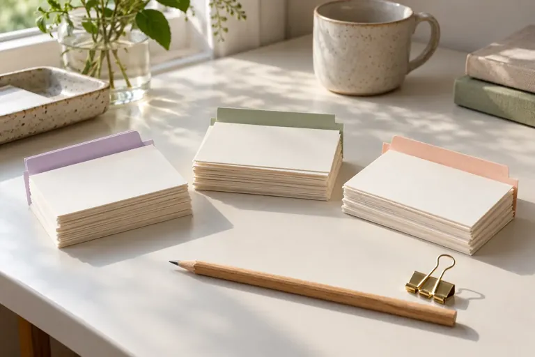
Under each reference, write a sentence naming the useful detail. “I like this image” records a preference; “the subject is small, and the empty space creates a sense of distance” describes a choice. You can reuse that second description in another context without reproducing the entire image.
Also notice what you don’t want to carry over. A palette may interest you even though the framing doesn’t suit your project. A layout may be readable but too dense for your needs. These limits clarify the reference and keep you from treating it as a complete model to copy. Before reusing a reference, distinguish inspiration, copying, attribution, and distribution rights.
You can add a very simplified sketch. Reduce a composition to a few shapes or a palette to a few colors. The sketch helps you understand a relationship; it doesn’t erase the source. Always keep the link to the image or object you observed.
Save the source when you capture it
Note the author’s or organization’s name, the title if you know it, and the address of the original page. A reposted image may have lost this information. Find the source before using it in a public document or a project that will be shared, and note any uncertainty until it’s resolved.
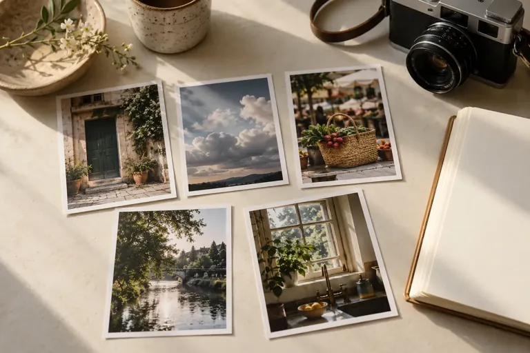
For your own photographs, keep the date and location at an appropriate level of detail. The photographic journal suggests keeping a caption that describes the context. If people are recognizable, think separately about private storage and sharing.
Reuse terms vary by document and use. Check the notice and license for the specific file. The BnF explains how to cite Gallica documents using a persistent identifier, which can help you find a resource again without relying on an incomplete file name. Citation does not eliminate the need to check the applicable rights.
Checklist
A well-documented reference
0 / 5
The collection can now help you compare choices, with sources you can find again.
 Read alsoGuided visualization: turning a dream into a concrete intention
Organize by use rather than vague styles
Categories like “beautiful,” “modern,” or “elegant” can become ambiguous over time. Try more concrete labels: high contrast, negative space, repetition, raw texture, side lighting, small format. You can combine them for each project.
Keep the number of categories small, and allow an image to fit under more than one question. A keyword system can help you avoid making multiple copies. On paper, an index or page references serve the same purpose. The filing system should make searching easier, not force you to choose a perfect category for every item.
Set aside a temporary selection for the project you’re working on. When it’s finished, keep the references that actually helped and note how. The others can go back into the general collection or be removed if they’re no longer useful.
Compare the references with one another
Place two or three images side by side and look for their differences. How does each one direct your gaze? What role do size, margins, color, or texture play? Comparing them often reveals choices you might not notice when looking at each image on its own.
You can also look for several solutions to the same question. To present an object, one might show a detail, another how it’s used, and a third its setting. None is automatically better. The choice depends on what your own project needs to communicate.
Avoid building a collection made up only of nearly identical images. It confirms a preference but offers few alternatives. Add a reference that solves the same problem in another way, then note what it teaches you. This variety can open up a possibility without requiring you to adopt it.
Move from reference to personal experiment
Choose one principle to test: a color relationship, a rhythm of shapes, or a way of leaving space. Apply it to a different subject, material, or use. Note what you change. The experiment should bring out your own decisions, not just reproduce an appearance.
Keep the reference near your experiment at first, then look at the result on its own. Does it serve your intended use? Some qualities of the original image may depend on a context that doesn’t exist in your project. You can keep the general principle while changing the form substantially.
The creative project journal helps you document these experiments and the decisions behind them. A reference can be useful even when you ultimately decide not to follow its direction. It will have helped you compare and clarify what you want to do. To turn a reference into an active experiment, create a notebook of observed color palettes with their sources and proportions. When you want to distinguish surprise from gratitude, you can keep a journal of wonder without requiring any particular emotion.
Review the collection to make it more focused
Every so often, revisit a few old references. Do you still understand why you saved them? Can you find the source again? You can add a new comment to some images and remove others. You don’t have to keep every screenshot to honor the interest it held for you at one time.
Notice the questions that keep coming up. They may point to a lasting curiosity: thresholds, shadows, small objects, or very open compositions. You can make one a personal topic to explore without concluding that this preference defines your entire style.
End your review with one small choice: a reference to document, a comparison to make, or an experiment to prepare. The collection stays alive when it feeds observation or practice. It can also simply remain a place for curiosity, as long as collecting doesn’t routinely replace the activity you wanted to begin.
Frequently asked questions
Is a screenshot enough?
It can preserve an image, but add the source and context. Without that information, you may forget where it came from or how you can use it.
Can I share my reference board?
Check the rights and terms for each item before making it public. A private collection and a public post are different uses.
How many images should I keep for a project?
Start with a small selection that answers different questions. Add an image only if it offers a choice or information the others don’t.