Contents
- What goes into a useful color notebook?
- Capture a palette without chasing impossible exactness
- Put together your color notebook in four steps
- Describe a palette without universal psychology
- Organize without limiting your perspective
- Assess a palette for your project
- Explore your associations
- A palette with a story: a corner of a kitchen
- Frequently asked questions
- Sources
A color notebook brings together combinations you observe in everyday life, along with where they came from and experiments for reusing them. To get started, choose a scene, note three or four shades, then see how their proportions and proximity change the whole.
You don’t need to buy a large box of paints or know all the color names. This workshop focuses on observation and composition. It avoids formulas that assign a universal emotion to each shade: your context, medium, and intention matter.
What goes into a useful color notebook?
A page can bring together a small swatch, three descriptive words, the place, and a composition study. “Market, late morning, blue crate and yellow pears” will help you find an association again better than “cheerful palette.” You can note your impression, but also keep the visual facts that prompted it. They’ll be easier to adapt in another project.
Josef Albers’s artistic explorations, presented by the MOCA in Los Angeles, examine, among other things, how a color appears to change depending on the neighboring shades. This reference invites you to experiment rather than believe that a color has a fixed effect on its own. It’s an art history reference, not proof that a particular palette will change your mood.
| Information | Example | Use |
|---|---|---|
| Source | Shop window after the rain | Recall the context |
| Shades | Dark blue, cream, yellow | Identify the elements |
| Proportion | Lots of cream, a little yellow | Understand the balance |
| Study | Squares or stripes | Observe how the colors sit together |
If you already keep a collection of visual references, this journal adds active practice. You’re not just saving an image: you’re isolating a relationship between colors and putting it to the test. A photograph found online remains a reference to credit; your own observations can offer a simpler starting point.
Capture a palette without chasing impossible exactness
Choose materials you already have: pencils, scrap paper, or small dabs of paint suited to your space. An annotated approximation may be more useful than a long search for the perfect pigment. Write “grayer than my pencil” or “very pale yellow in the shade” when your materials don’t reproduce the scene exactly.
For a digital palette, keep the original photo and the lighting in which you took it. A color code identifies a value in one system, but it doesn’t guarantee an identical result on every screen or in print. If your project requires technical accuracy, you’ll need suitable checks. For this personal journal, focus on relationships: light and dark, vivid and muted, large area and accent.
A creative observation walk can serve as a way to collect ideas. Choose a single theme, such as doors and their walls, to avoid gathering a multitude of unrelated images. Don’t remove material from a building or plants from a place where it isn’t permitted: a note, drawing, or permitted photograph is enough.
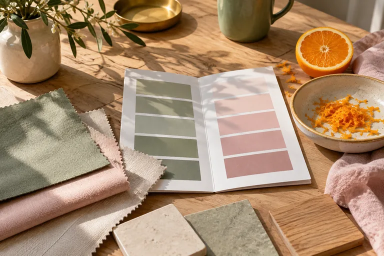
Put together your color notebook in four steps
1. Isolate the dominant color
Look at what takes up the most space. In a kitchen scene, the cream wall may dominate even though your attention goes straight to a red dish towel. Those are two different roles. Note the dominant color, then the accent. You can recreate their relationship without using exactly the same objects.
2. Choose a connecting color
Between the dominant color and the accent, a third shade can create a transition or add another contrast. Try a brown, a gray, or a color already in the scene. There’s no choice that’s automatically harmonious. Cut out three shapes and move them around: you’ll see what each combination brings out.
3. Vary the proportions
Make one version with lots of cream and a small touch of red, then reverse the proportions. The colors stay the same, but the composition no longer gives the elements the same visual weight. Keep both attempts in your creative project journal. This comparison will be more useful than a general conclusion such as “red is intense.”
4. Try it in a small project
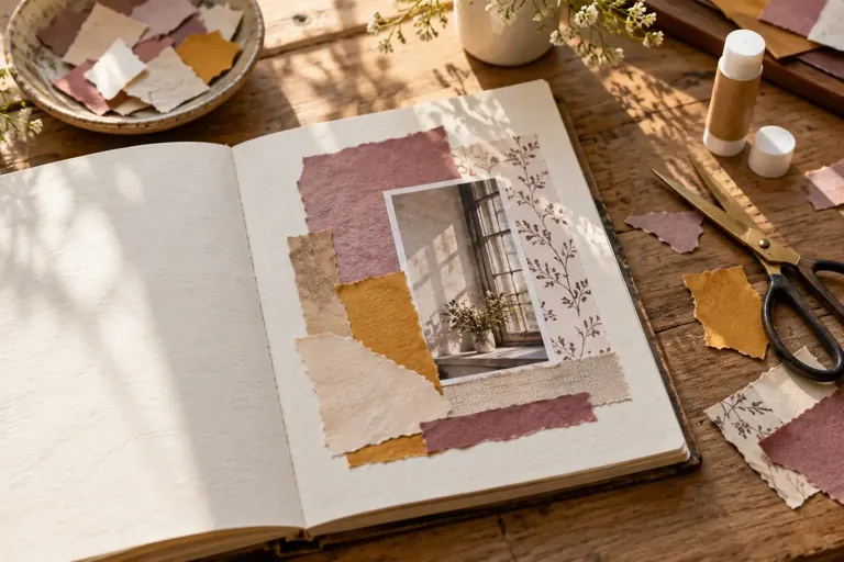
Apply the palette to a card, a creative collage or a simple drawing. A row of squares may look balanced and become confusing in a complex composition. The test reveals what the format needs: one color for the background, another for a shape, a third for a detail. You can then remove a shade instead of adding yet another.
Describe a palette without universal psychology
You can write, “This combination reminds me of my grandmother’s tiles” or “I find it calming today.” These phrases describe your experience. “Blue calms everyone” would be a much broader claim than your observation supports. Your journal doesn’t have to become a psychology guide to be personal and useful.
If you want to describe the colors more precisely, use tangible comparisons: shadow blue, bottle green, sun-faded pink. The metaphor notebook can help you create these images without confusing them with technical names. Keep a visual sample too, since two people may not imagine the same shade from a phrase.
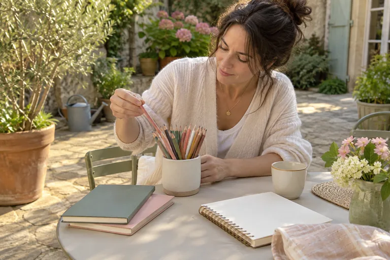
Workshop: one palette, three experiments
Proportion experiment
Keep three colors and swap out the one that takes up the most space. Notice what draws your eye now.
Experiment with neighboring colors
Place the same small square on two different backgrounds. Observe how it looks without changing the square.
Experiment with use
Turn the palette into a small, real composition. Remove a color if it has no purpose.
 Read alsoScripting: Write your dream life to clarify what you want
Organize without limiting your perspective
Organize the pages by source, project, or visual relationship, depending on what you look for most often. A “soft contrast” category can bring together very different scenes. A “morning commute” category preserves more of the memory of a place. The idea notebook can have a simple index instead of a copy of every palette.
Add a date when the light or season matters. The journal for the changing seasons and the nature journal offer complementary contexts. You can revisit the same place without trying to recreate exactly your first impression: the difference itself becomes information for your creative work.
Assess a palette for your project
Ask for specific feedback on the composition: where the eye starts, which shapes stand out, and which elements blend together. A personal preference for green doesn’t determine whether your page is readable. Distinguish taste from function, especially if the palette will accompany text or practical information.
To finish, choose one palette to try and two to keep in reserve. A solo creative session can end with this modest decision. Your notebook succeeds when it helps you find and transform a relationship between colors, not when it looks like a perfectly coordinated collection.
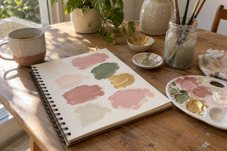
Explore your associations
Generator
A color collection
Note a dominant color and an accent color in a kitchen.
See all the phrases
Place
- Note a dominant color and an accent color in a kitchen.
- Observe a door and the wall around it.
Material
- Compare a matte color with a nearby glossy surface.
- Look at the same object in the light and in the shade.
Quiz
Color and context
A color has exactly the same effect in every composition.
See the answer
No. Surrounding colors, proportion, and context all contribute to how it looks.
A personal impression should be presented as such.
See the answer
Yes. Your observation doesn’t prove a universal response.
Flip cards
Refining the palette
Everything draws the eyeFlip
Reduce the space an accent takes up or the number of shades.
The result doesn’t look like the memoryFlip
Note the lighting and accept a context-specific approximation.
I keep too many palettesFlip
Give each one a purpose before collecting more.
The code seems precise, but the impression changesFlip
Test the final medium instead of relying only on the screen.
Checklist
A documented palette
0 / 5
Your palette becomes a resource you can transform.
A palette with a story: a corner of a kitchen
Imagine a cream-colored table, a dark blue box, and two clementines. You can pick out three colors, but they cover very different areas. The table fills almost the entire view; the box frames one side; the fruit provides accents. If you draw three equal bands in your journal, you preserve the hues but lose some of the relationship you observed. So add a small sketch showing their proportions next to the swatches.
For your first try, keep a light background and two small shapes. For the second, make blue the background and use a smaller area of cream. The clementines can stay in the same place. Compare what seems to come forward or recede, what stands out, and what blends in. You don’t need to conclude that one version expresses a particular emotion; simply describing how your gaze moves is enough.
Finally, apply the palette to a page that has nothing to do with the kitchen. You’re turning an observation into a compositional choice without reproducing the scene. Note the adjustments, especially if your paper or pencils can’t achieve the same intensity. That way, your journal keeps both the source and the way you’ve adapted it.
For a complementary perspective, watch this video from Laura Horn Art.
Frequently asked questions
How do you start a color journal?
Choose a scene and note three shades and where they came from. Then make a small composition study instead of collecting lots of palettes right away.
Do you need to buy paint?
No. Pencils or paper you already have may be enough. Note the limits of an approximation when your materials don’t reproduce the color exactly.
How many colors should you keep?
Three or four are a simple starting point. Add a color only if it plays a role in your project.
Do colors have a universal emotional effect?
This notebook doesn’t make that promise. Describe your impression and its context instead of attributing it to everyone.
Can you use photos?
Yes, while keeping track of where they came from and the conditions in which they were taken. A photo and a screen can change how the scene you observed looks.
How can you reuse a palette?
Try it in a small, real composition. Vary the proportions before deciding whether it works.